Burndown Chart: Theory and Excel Template

Burndown Chart: this article provides a practical explanation of a Burndown Chart. Next to what it is, this article also highlights the information in a Sprint, an example on correct reading, the Pros and cons and a Burndown Chart Excel Template. After reading, you’ll have a basic understanding of this practical process management tool. Enjoy reading!
What is a Burndown Chart? The theory and basics
A Burndown Chart is a graphical representation of the remaining tasks or activities during a certain period.
The graph is often used in project management – for example, in combination with the Scrum Methodology – and helps teams to monitor the progress of a project.

It is important for the project manager to have a project run according to plan and to predict whether the team can realise their goals within the set time.
The graph consists of an X and Y axis. The X axis indicates the remaining time, whereas the Y axis visualises the amount of work that has yet to be completed. Every day, team members work on their assigned tasks.
Afterwards, the amount of work can be plotted, and the graph will show a downward trend. A burndown chart starts with the complete amount of work and slowly ‘burns down’ until nothing is left, and the goal has been realised.
Because it is easy to understand and has a motivating effect, this simple and visually appealing graph is used by many project managers.
For example, burndown charts are often part of brief stand-up meetings in which the completed and remaining work for a certain project is discussed. This forecasting tool provides an overall picture of the current situation.
Burndown Chart in Scrum: information in a Sprint Burndown Chart
As mentioned, a burndown chart consists of a X and Y axis. These axes represent a variety of information. After entering the data, the graph plots a line that shows the current status of the project or sprint.
In addition, it shows the amount of work that has yet to be completed. In short, a consists of the following information:
Total estimated labour and time (axis)
At the start of the sprint, the project manager or quality assurance team estimates how much labour is required for a specific task. The estimated versus the actual time and labour is tracked in the chart.
The Y axis shows the total labour, the X axis shows the time.
Amount of labour and remaining time (axis)
The Burndown Chart also visualises the amount of time the team has burnt up to a certain period in time.
The remaining labour in a sprint can be added by plotting points against the Y axis. To get a quick overview of the remaining labour, you can also decide to represent labour in hours.
Ideal effort (line)
This straight line in the burndown chart visualises the project progress under the most ideal circumstances. This means no delays and no additional tasks that are added over time. The line runs from the start of the work or assignment, at the top of the Y axis, towards the end point in time, to the right at the end of the X axis.
Actual effort (line)
In general, this line varies from the line that indicates the most ideal scenario.
After the team has completed a number of tasks, part of the remaining effort will burn away. When more items or tasks are added after the start of a period, you will see a peak in the actual effort line.
Burndown Chart example: correct reading
The project manager is responsible for the final product and achieving the set deadlines. He must therefore keep a close eye on how the team is performing.
The progress of a sprint can look very differently in a burndown chart. Below is an explanation of various scenarios. The scenarios below assume a total project duration of seven weeks and a total of 100 tasks.
Ideal situation
The example below shows an ideal situation. This means the project team can stick to the plan and manages to realise the sprint goal in time.
In a more realistic situation, the line representing the actual effort will run slightly above the sprint plan line.
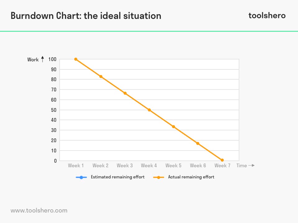
Figure 1 – The ideal course of a Burndown Chart
Unexpected situation, an Burndown Chart example
In the example below, the team is confronted with unforeseen circumstances. For example, new tasks may have to be added in order to realise the goal.
These activities were not included in the plans in advance and thus cause a peak in the current remaining effort.
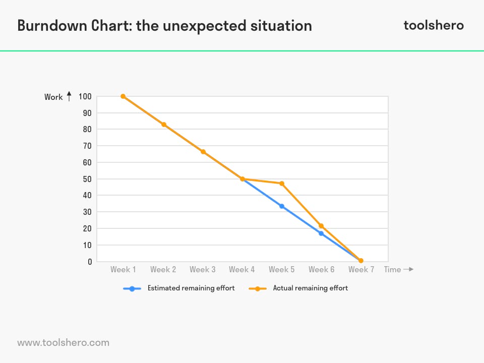
Figure 2 – unexpected course of a Burndown Chart
Bad situation
The example below shows an alarming situation because the actual remaining effort constantly sits above the line that indicates the estimated remaining effort. Failure to run a sprint according to plan may have several causes. The first is incorrect planning with incorrect estimates.
Another cause may lie with the team itself. If for some reason the team fails to stick to the plan, the project manager must closely keep track of this and possibly push the team at the end of a sprint in order to meet deadlines.
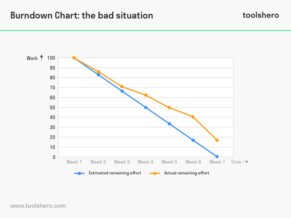
Figure 3 – bad situation represented in a Burndown Chart
Pros and cons
These types of charts are a powerful and effective tool with many strengths. Unfortunately, they also have a few shortcomings.
Pros of a Burndown Chart
- These are easy to use and read
- These charts clearly visualise the performance of the team
- These charts also clearly visualise what has yet to be achieved
- These charts have a motivating effect on the team
- The use of these charts helps the project manager and team to keep a full overview
Cons of a Burndown Chart
- User-friendly software for creating burndown charts is expensive, and the options in Microsoft Excel are limited
- The motivating aspect of burndown charts can also be a pitfall. For example, they could lead to exaggerated expectations
- Only the progress of an individual sprint or assignment is shown. The complete picture is missing
- These charts do not show which tasks are under development
Burndown Chart Excel Template
To set-up your own Burndown Chart, you can use this ready-to-use template / worksheet in a Excel format.
Download the Burndown Chart template
This template is exclusively for our paying Toolshero members. Click here to see if a membership is something for you!
Now it’s your turn
What do you think? Are you familiar with the explanation of a Burndown Chart? Do you use Burndown Charts for your projects or assignments? What do you think are elements that can contribute to effective monitoring of progress? How do you think burndown charts can be applied in practice? Do you have any tips or additional comments?
Share your experience and knowledge in the comments box below.
More information
- Cervone, H. F. (2011). Understanding agile project management methods using Scrum. OCLC Systems & Services: International digital library perspectives, 27(1), 18-22.
- Burke, R. (2013). Project management: planning and control techniques. New Jersey, USA.
- Kerzner, H., & Kerzner, H. R. (2017). Project management: a systems approach to planning, scheduling, and controlling. John Wiley & Sons.
How to cite this article:
Janse, B. (2018). Burndown Chart Theory. Retrieved [insert date] from Toolshero: https://www.toolshero.com/project-management/burndown-chart/
Original publication date: 01/02/2018 | Last update: 12/13/2023
Add a link to this page on your website:
<a href=”https://www.toolshero.com/project-management/burndown-chart/”>Burndown Chart Theory</a>
Ben Janse
Ben Janse is a young professional working at ToolsHero as Content Manager. He is also an International Business student at Rotterdam Business School where he focusses on analyzing and developing management models. Thanks to his theoretical and practical knowledge, he knows how to distinguish main- and side issues and to make the essence of each article clearly visible.

Related ARTICLES

Agile Method of Software Development

DMADV Process: the Basics and Steps

HACCP plan explained

Charles Kepner biography and books

Eight Dimensions of Quality by David Garvin