Spaghetti Diagram: Explanation & Examples
Spaghetti Diagram: this article describes the concept of the Spaghetti Diagram, also knows as a Spaghetti Model or Spaghetti Plot, in a practical way. After reading you will understand the definition and basics of this powerful quality management tool.
Highlights include: what is the spaghetti diagram, lean six sigma, application and drawing of the spaghetti diagram, an example and some improvements.
What is the Spaghetti Diagram?
In lots of companies, the use of available space isn’t exactly optimal. There are corners no one uses or annoying detours people must take to get to the printer, for instance. The same is true for production halls; the routing must be optimal to prevent waste as much as possible.

A Spaghetti Diagram can help achieve this goal. Such a diagram is a visual representation of the route employees take through the office or on the factory floor every day or of products that make their way through the production halls. This representation is often complicated and when visualised, it resembles a jumble of spaghetti on a plate. That’s where the name comes from.
A Spaghetti Diagram shows the continuous flow of an activity during a process. It provides insight, making it easier to identify and remove redundancy in the work flow, which will speed up the whole process. This diagram is also known as a Spaghetti Chart.
Lean Six Sigma
A Spaghetti Diagram is a Lean Six Sigma tool and provides a drawn map of the workplace.
Lean Six Sigma is about eliminating unnecessary actions, making the work process much more efficient. All redundant movements of employees and transport of goods are mapped. Think of walking to and from conference rooms, other departments and machines. But the transport of materials and final products can also be included in the diagram.
For example, hospitals benefit from identifying how patients and visitors move through the building. But it’s also an ideal tool for large restaurants and supermarkets to know what the actual physical flow and distances are within a work process. The Spaghetti Diagram provides a clear visualisation of those things.
Application
A Spaghetti Diagram analyses the distance travelled in the workplace, such as going back and forth and time wasted when moving about and/ or transporting things. This creates awareness of all the time those activities and movements take up, which can lead to management arriving at surprising conclusions.
It’s shows in one glance how many inefficient and unnecessary movements there are. You can for instance see employees of non-adjacent departments who work together a lot, waste a lot of time with walking to and from.
Some companies have a fax machine or printer situated in a specific corner of the department. This doesn’t just mean a lot of going back and forth, but also waiting until colleagues are finished.
The Spaghetti Diagram can lead to designing a new layout and routing, where employees have to walk back and forth less, goods get to where they need to go more quickly and processes are more efficient.
How to Draw a Spaghetti Diagram
To create a Spaghetti Diagram, it’s important to first have or create a proper map of the workplace. Subsequently, a line is drawn on this map from the start of a process to its end.
This line can represent the movement of one employee or one product. Then, the movements of all employees and products or activities are also visualised. This has to be the actual situation, based on real observations.
All facilities, machines, tools must be represented as well as the locations employees have to move to. It’s handy to mark areas that lead to inefficiency in the process so these are immediately recognisable and can be more easily improved.
For drawing a Spaghetti Diagram, the following tips are indispensable:
- Make the Spaghetti diagram to scale, making it easier to calculate the total distance travelled.
- Count the steps that all employees take. This provides a good indication when the ratio (scale) is unknown. This makes it easier to assess where things are most inefficient.
- Draw a separate line per employee, so the frequency per time unit can be more easily calculated (minutes, quarter-hours, hours). This allows for calculating the total distance and time wasted.
- Represent the route as naturally as possible. This means that straight lines are practically non-existent; the Spaghetti Chart will mainly show winding motions.
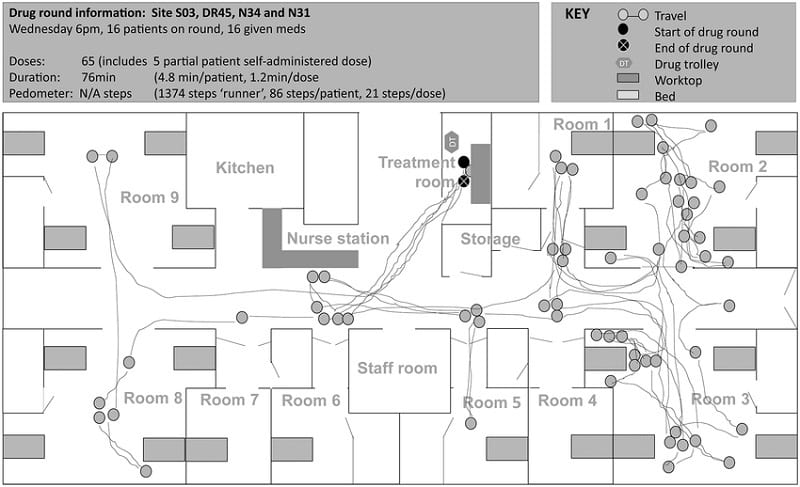
Figure 1 – Spaghetti Diagram Example
Spaghetti Diagram example of a medical situation
- Source: Researchgate
- More background information on the Spaghetti Diagram example, can be found here
Spaghetti Diagram and improvements
A Spaghetti Diagram clearly shows where most time is lost. By identifying bottlenecks, management can then rearrange the workplace or work areas, which will reduce the number of (transport) movements.
As a result, the Spaghetti Diagram provides a fine basis for redesigning the process, office, factory floor, layout of rooms and/or machines. It enables opportunities to expedite process flow.
Sometimes, this may lead to the conclusion that an additional room is needed or that a room must disappear. Minor renovation could provide a solution in that case.

It’s Your Turn
What do you think? What is your experience with the Spaghetti Diagram / Spaghetti Chart? What do you do to improve the physical workflow? Do you recognize the practical explanation or do you have more additions? What are your success factors for good quality management?
Share your experience and knowledge in the comments box below.
More information
- Alukal, G. (2007). Lean kaizen in the 21st century. Quality progress, 40(8), 69.
- Tanco, M., Santos, J., Rodriguez, J. L., & Reich, J. (2013). Applying lean techniques to nougat fabrication: a seasonal case study. The International Journal of Advanced Manufacturing Technology, 68(5-8), 1639-1654.
- Tyagi, S., Cai, X., Yang, K., & Chambers, T. (2015). Lean tools and methods to support efficient knowledge creation. International Journal of Information Management, 35(2), 204-214.
How to cite this article:
Mulder, P. (2018). Spaghetti Diagram: Explanation & Examples. Retrieved [insert date] from Toolshero: https://www.toolshero.com/quality-management/spaghetti-diagram/
Published on: 06/21/2018 | Last update: 11/09/2022
Add a link to this page on your website:
<a href=”https://www.toolshero.com/quality-management/spaghetti-diagram/”>Toolshero: Spaghetti Diagram: Explanation & Examples</a>